
We love scuba diving and in Diving Menorca, like good marine scientists, are extremely professional and careful but educational at the same time. The atmosphere in the dive centre is friendly and they use humour as a key way for their communication and teaching formulas. We should then imprint a not very serious brand personality but, of course, pro in the new identity work.
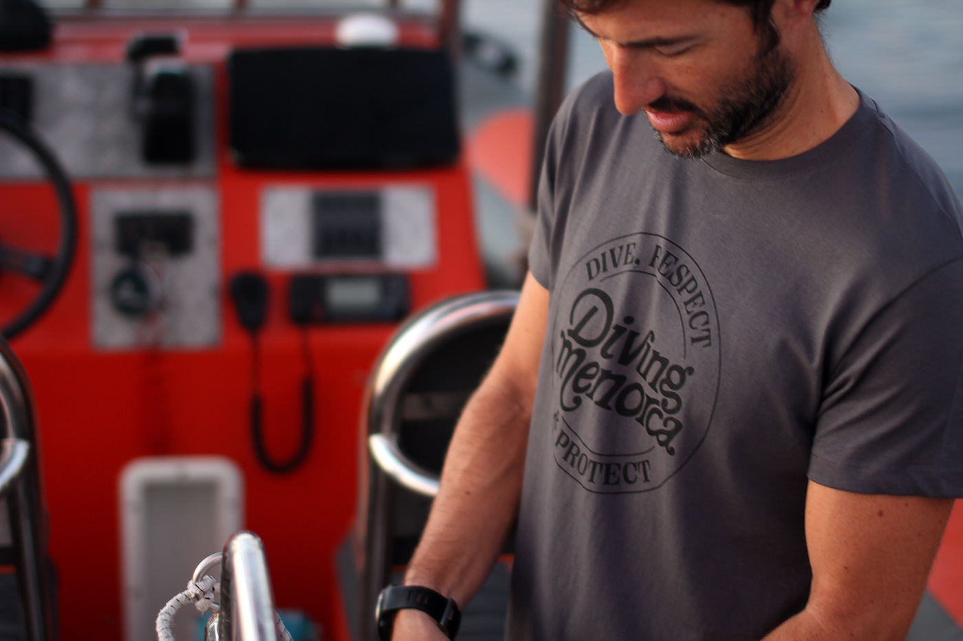
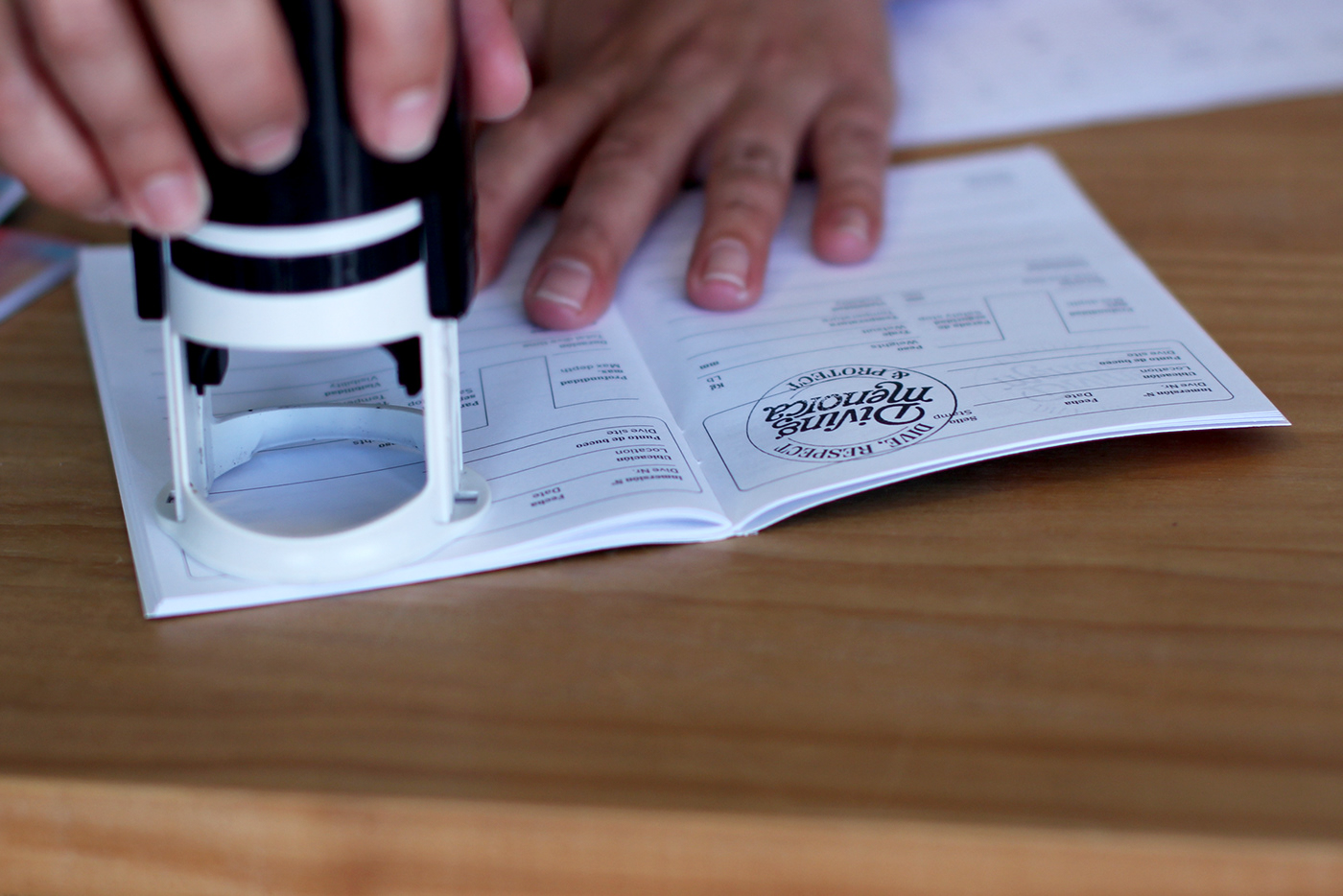
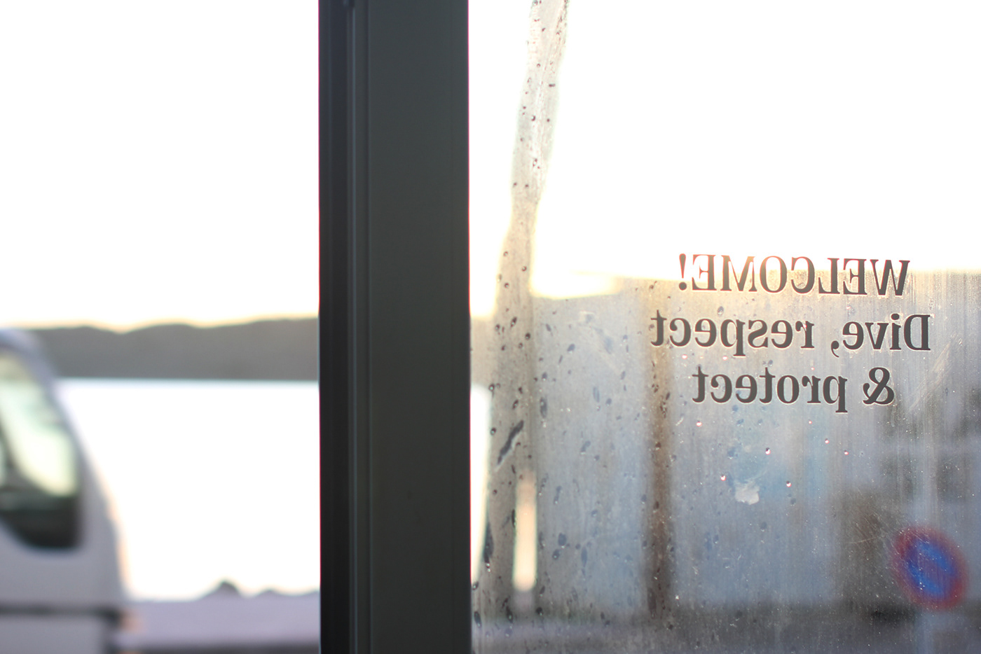
Diving Menorca aims for excellence in their field. They personalised the way of teaching and working with each diver, so the identity redesign had to be a complete revolution for them, for their global brand imagery and visual identity. After the discovery phase we define the branding guides and concepts: a lettering-retro-type logotype + an illustrated divers archetypes-crazy-idea for the visual exploration of the brand. Check the visual system development of the brand identity here.


Diving Menorca is based in the north of the island, where the Marine Reserve is located, so divers can experience first-hand its transparent waters, the red soils of the north coast line and the unique sun light of this part of the island.


→ Art Direction, graphic design, photography and production management: Pilar Sola
→ Client: Diving Menorca
→ Client: Diving Menorca


